Monday, November 29, 2010

I Cheat Towards the Pretty

Photobucket

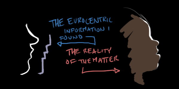
A few years back, I refused to do digital art at all. I considered it "cheating".
After all, "the materials don't make the artist", right? Or at least they shouldn't. I resented the praise that digital artists got for "smooth lines" and all that shiny crap you can do so easily with a computer and tablet.

I didn't download gimp until I felt really good about pixels.

Photobucket
(Some weird thing for a pixel site I was active on)

I refused to get a tablet until I knew I could work with the touchpad on my laptop.

Photobucket
("The Last Great Touchpad Project")

I denied myself use of pressure sensitivity, a undo/redo button, by using that silly little paint program on facebook.

Photobucket

But I've realized that in the end, no one cares about the process but me. My job is to serve the end result, and find The Pretty.
I can make more, and better pictures if I use the tools I have.

So let's draw a weird-ass baby!

Photobucket

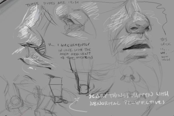
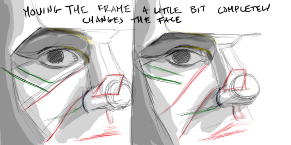
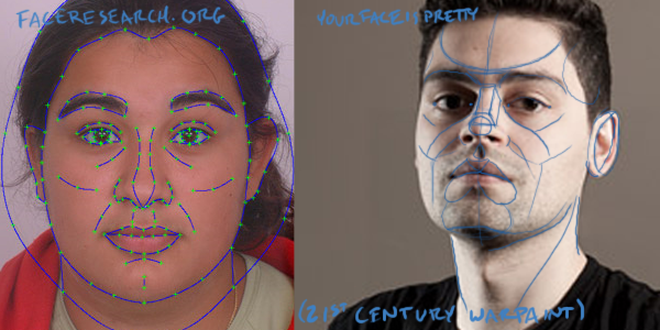
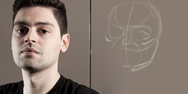
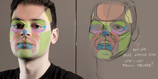
First, I make a trace a little map for myself. I've used gridding before, but I have problems keeping things feeling three dimensional that way.

Then I create a new document, and start blocking in general areas of color and shadow, using the original as a reference.

Photobucket

Then I spend a million years layering, and relayering, until the form is solid enough to remove the lines.

That's when the real cheating starts.
I've gotten to the point where my free hand sketch will almost line up with the original anyway. But why go through the trouble? I know I can do it, so at this point, I just overlay the drawing with the original and fix all the proportions from there.

At some point, I get distracted by some amusing detail. At which I switch to my tiny brush and detail it. It takes about an hour for every 100x100px box I detail. Slightly less for eyes.

I'm not going to finish this baby because it break my number one rule in my art: the painting has to be better than the reference. Otherwise, I'd be a super cheat and just take pictures. ;)

Monday, November 15, 2010

Why Gareth Bale looks like a Shark


If you're a football aficionado, you're probably familiar with the "Gareth Bale/Monkey" theory.
Though fairly accurate as far as proportions go, it's also completely uninteresting to me.


According to the internet, if you wear glasses, have a low brow, stick out ears, a larger nose, a shorter nose, thin lips, or have ever opened your mouth in public, you look like a monkey.

So what? Humans are built nearly the same as monkeys anyway.

Myself, my first thought when I saw him was "Shark". My friend agreed, and demanded that I study this further.

Photobucket

I began by mapping out our two subjects.


The first, a young 21-year-old welsh human.
The second, a fearsome great-white-shark, of indeterminate age and gender.


Photobucket


The similarities are striking, right?

Okay, so it's not as pronounced as monkey is.

Here's Bale, reduced down to a cartoon. Just enough to keep him looking like himself.
This is what I know about him.

Photobucket


1. There's a weird dip between his cheekbones and brows from front and 3/4 veiws.

2. This is partly due to his low, heavy brow line.

3. There's just barely enough room for an eye-width between his eyes.

4. At rest, his mouth is of average size, as near as I can figure (the corners fall under mid-eye). But when we look at it with the rest of his face (the narrower back part of his jaw, his tiny nose, his small close-set eyes to name a few) it sure does seem massive, doesn't it? I guess he has a narrow face or something.

5. We can fit a hole eye-height between the bottom of his nose, and the top of his upper lip.

6. The form of the muscles around the mouth is huge. It makes crazy lumps.


Additionally, it's worth noting that he has a jutting jaw to the front, and his neck is super thick.

What happens if we measure these things on a shark?

Photobucket

1. Although the sharks eye sockets are formed differently, which kind of destroys any brow line, the shape is still present. At least to me. This kind of thing is like cloud watching: I'm like "Oh look! That one looks like a shark!" and maybe you think it looks like a duffle bag.

2. Sharks don't have to shade their eyes from the sun, so they don't have little bony crests up there like we do. Also, they don't have eyebrows.

3. This time, we can fit many, many eye-widths in. Bale doesn't have Shark-ish eyes, that's for sure.

4. Massive mouth of doom. No lips to speak of. Also, this shark has dimples like Bale. Aw...

5. From some angles, shark noses look huge. From others, they're humorously tiny pointy bits. Bale looks more like a Shark as viewed from below. Just before it devours you.

6. Massive mouth of doom requires massive muscles.


Four out of six. That's not bad.

The moral of the story: His mouth takes up too much room and his head is lumpy.


Photobucket

And he gets bonus points for his giant muscled neck that would allow him to glide through the water with minimal drag.

(Dear Mr. Bale, sharks are awesome. You're face is awesome. You're awesome.)

Friday, October 22, 2010

My Noses Keep Falling Off

Somewhere between drawing the eyes and drawing the mouth, I always lose my way. I just can't connect the mouth to the nose properly.
These are some scribbles of the stuff that's been going through my head lately.
The gray is symbolic of my lack of insight into the situation. The noses symbolize that I like noses a lot.

Saturday, October 16, 2010

People on the Bus Rock my Poor, Uninformed World


It never occurs to me that proportions like this happen. I think that's pretty lame.

Wednesday, June 2, 2010

The Life and Times of a Solitary Arm Fuzzy (And how he found his shadow)

Photobucket

This is not a story about a face. This is a story of friendship and joining together! A story of light, and shadow! A story of the rise and fall of arm fuzzies!

Photobucket


Barry was a hair. He was dark and tapered, just like a hair should be. He grew up out of a funny little crater, just like a hair should. He even got light highlights and dark shadows on his body, just like a fuzzy should

But Barry had a problem. Barry had no shadow.

Photobucket

Barry was pretty sure he was supposed to have a shadow. Doesn't everybody?

Photobucket

Barry knew that an object's shadow was defined by the direction of the light and the angle of the surface the shadow is cast on.

Photobucket

Barry plead with the universe "Why! Why don't I have a shadow?!"

"HAHAHAHAHAHA!" Said the Evil Force of Diffusion ", I scatter light, and blur shadows!"

Photobucket

Barry gasped ",You blurred my shadow to death?! Oh! If only I were larger so I could defeat you!"

Suddenly, a great, chill wind blew and all Barry's friend rose, and stood beside him. Each cast their own, small and blurry shadow. Together, they made a slightly larger, reasonably visible shadow.

Photobucket

"Huzzah!" said Barry "I have a shadow!"

The End

Photobucket

(A) When I started drawing.
(B) When I got bored of hair and hair shadowing.
(C) When I realized it was ridiculous to try to illustrate something that I just figured out is nearly invisible anyway.


Moral: Diffusion doesn't give a rat's ass how big you are, it'll blur your shadow just the same. If that means the shadow no longer shows up, too bad. Diffusion has no patience for weakness.

Yep, I've been doing that all wrong. I've been carefully edging far too many, far too tiny shadows.

Photobucket

Monday, May 31, 2010

The Evolution of the Face Map: Part 2, 3d Puzzles, A WIP

Photobucket

Where were we... oh yes. I finished up the stupid flat way of seeing things and moved on to bigger and better things.

It's like this, when I want to draw a face, I have to make the picture in my head before I draw it. I used to do this by lining up two dimensional shapes like tan-grams, but now it's like building models out of foam.

I start by making a kind of contour drawing of the forms I know and how they fit together on that face: a map.


The shapes that I mark out are fairly consistent, and only getting more so as I practice.

They bear a resemblance to the points marked out by facial research groups.

Have you ever looked at the faces made by those programs? They're often hideous and make no sense. I think their models neglect the third dimension and facial structure. (You all know giving people creepily tiny chins is more attractive, right?)

I have a bad habit, starting with that dumb circle. I don't like circles, they don't leave any lines on the page to help me with depth of field. I like boxes and intersecting lines much better.

I tend to mark in the forhead or brow line next these days. From there is easier to sketch in the trapezoidal prism of the bridge of the nose.

I know I should be putting that curved line that shows the center of the face first, but I never think of it until I've already failed at the nose a couple times.

The base of the chin has to come next.

Next is the marking out of the cheeks and eyebags.
Depending on the day, I might mark the top, crest, or bottom of the cheekbones. I haven't figured out which is the most useful yet. As long as I remember which one I'm marking, it's all good.

Especially on the right side, hopefully you can see some fancy parallel curves (wow, I thought I made that up) happening.

Recognizing curves that are parallel, or the amount by which they are not parallel helps define form.


It's one of those things you have to practice.

Here, the line-age is about to get complicated, so let's turn Chris into a mexican wrestler so you can see what I'm doing.

If you've got a good eye, you can see the shapes I've got below the nose don't quite fit together right below the nose.
If you've got a poor eye, I'll just tell you. I have trouble lining things up below the nose.

List! Everything I just marked out up there:

- The dome of the forehead is marked in pink, and the temples in yellow

- Nose-turning-into-forehead-triangley-bit, in yellow

- Two halfs of the eye socket in purple and green, with that little triangle bit I like so much (discussed already Here)

- Sides of the face, under the cheekbone, in green.

- Third eyebag shown in pink.

- Nasal labial folds in green.

- Boney nose bridge in green.

- Ball of nose in blue.

- Mouth cone in pink.

- Upper lip planes in green and pink.

- Lumpy bits that make up the lower lip, in blue.

- Chin ball in green.


It's a work in progress.

Monday, May 17, 2010

The Evolution of the Face Map: Part 1, Overcomplicating Ed Emberley

(I have no excuse anymore! I have way too many discoveries that I've failed to post while my life was a bowl of nasty rotten curry. It sucked for a while, but now I need to get over it.)

Image Hosted by ImageShack.us


In the beginning, Ed Emberly taught me to draw an Aligator.
In case you're not familiar with Ed and his drawing books Here. I used to draw out of his books all the time as a kid. He's a genius, and he's influenced the way I think about drawing at the most basic level.
You can see that best when I first sketch out a picture.

When I first sat down to try to draw people proper I would set up my reproduction kind of like this:


I'd start with the old divided up ball thing. This is the "easy" way people say to do it. (They're crazy.)
I've found that if I start with a frame that doesn't really look like the person I want, the final is far less likely to work. Or at the very least, it's going to give me shit all through the process. I had hoped never to share the following image.


For the good of the masses, Alfi's terrifying fail demons have been released! Agh.
As you can see. His facial features are floating around unpleasantly through the versions. I know I marked them out, just like people say to. Technically my fault, I know. But still... that can't be the best way for a beginner to mark up the page. It leaves too many variables and relies on visualizing skills that a beginner just doesn't have.


Chopped up circles can be all sorts of shapes. I know, faces do too, whatever. But if you're looking for a certain face, what good is a framework that shifts around so freely?

It's kind of like alligators. They'll bite your face off. No. You can make a variety of different kinds of alligators, just by shifting the sizes of a few of the shapes Emberley gave us.


And the chopped up circle thing isn't even half as specific as an alligator! At least with alligators, we know for sure that the point bits of the tail shape have to connect to the point bits of the rectangle body, right? All we know about that jaw-ish shape is that it ends somewhere.

Ok, there are tricks to make that work right. Tricks that are mostly eyeballing ratios of sizes and angles and other things that I couldn't do two years ago.

I'd then mark out the eye sockets, assuming that they'd be the darkest area. Which isn't always true, because of lighting. More problems. Though it did help me visualize...

After that, I'd start marking out simple geometric shapes in the shadows and highlights.


I used geometric shapes at first so I could see exactly how things lined up. It was useful then, as I didn't have the eyeballing skills to line it up the way I do now.


My poor brain would have imploded trying to see all those weird curvy lines.

I think maybe it's like fractals. Shapes within shapes, you know? I can use curvy lines now because I break them down automatically.


Art is a lot of hand/eye coordination. But I think the eye is the more important half*. Or at least, the more difficult. Everything else is just shipping your brain fruit out to the masses.


Join us next time as Alfi explains exactly what she's doing with all those weird-ass curvy lines nowadays. For reals! And it's not going to take three months either!


Ps, don't go telling me your Brain Fruit is awesome, and your fruit pickers suck. They're squishy, and no amount of preservatives will get squishy fruits from Cuba to Cali.

Sorry, I'm making a lot of assumptions there. Some people actually do have crappy workers. But most likely,: SQUISHY. The end.

(*Politically Correct Police! Blind people still conceptualize space, and Art around like the rest of us.)

Monday, February 15, 2010

Appease the God of Proportions: Using bitty bits of face for measurement

Photobucket

The eyes are an awfully important part of the face. If they're off, people will notice and the god of proportions will smite you.

So how do you keep them from floating out of their sockets and killing you in your sleep? You nail them down with the parts of the face you never knew you cared about.

Photobucket

There's a nice little pizza slice of a plane that has always helped me link the shape of the orbit to the corner of the eye. Its shape varies a lot, but that makes it easier to find the differences in the face I'm looking at.

Photobucket

The first point of interest is at the corner of the eye. (A)

The upper line of the plane (B) is a place where the orbit looks like it sort of folds. The curve of this line depends on the amount of fat in the upper upper eyelid.

The lower line (C) may be less obvious, depending on the face. Being a place where a lot of action happens in facial personality land, it might be cut off by lower lid eyebags, or wrinkles. I just call as I see it per face.

The final, outer line (D) goes along the rim of the orbit. After this line, there's a big drop off into the side of the head.

Photobucket

Measuring the shape and angles of this plane against that of any other consistent shapes I see on the face (irises are always good for measuring against) makes it easier for me to place eyes proper.

Photobucket

Friday, February 12, 2010

Bowls of Soul and Whatever (Shiny things make people happy)

More bowls today!

Bowls are good for catching souls, apparently. That's what they say when I successfully perform shiny on an eye in realism. No offense to those who believe in that sort of thing, I find that puzzling. Eyes aren't a window to the soul, they're shiny balls of jelly. No one says anything about soul when there is no shiny. Which is not to say that shiny is the only thing you need to make "soul".

Photobucket

Did I ever mention that I hate manga?

The direction we're looking with our eyes is a strong kind of body language. There isn't a set of rules for what looking in a particular direction means. It's all in the context of expression and whatever else is going on.

Photobucket

The amount of white showing also plays a part in recognizing the intensity of an emotion.

I hate it, but eyes suck focus in pictures, and therefor need to be shaded and shinied properly.

Shiny is basically drawing in two layers. The iris is a concave bowl. The cornea is convex and is mostly invisible, except for reflections of the space around it, and distortions of anything behind or beneath it.

The iris is a shallow bowl, with a little raised part in the middle around the pupil. like a chips and dip platter. There's a kind of weird drop off out of the white jelly part into the iris. Depending on the light and the specific eye shape, that can make for a darker outline.

Photobucket

Ignore the cornea (the clear jelly over the top), it's invisible. What's not invisible are the reflections it shows across its surface. Brighter things, lamps and windows and explosions are more likely to cover the image of the iris. Where there are shadows, from eyelashes or other things, the reflections won't show.

Photobucket

The iris may be visually displaced by the cornea. I don't think it's that big of a deal unless we're looking from the side.

Photobucket

The shiny happens with hair, sweat, even within the layers of skin. When drawing layers of objects with low opacity, remember that you're not actually drawing one layer over another, you're NOT drawing the light spots of each layer.

Photobucket

Unless you've got Photoshop and you can cheat like me.